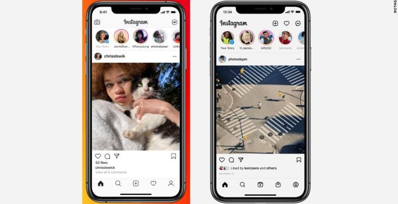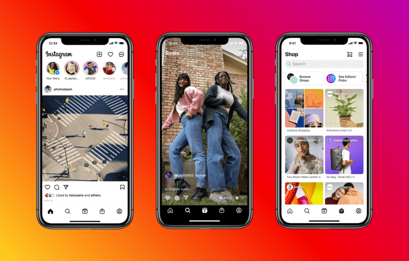
Instagram is making major changes to the layout in its app, adding new dedicated tabs for reels and shops. The company mentions that this change gives the app a fresher and more modern touch.
The company recently integrated Facebook Messenger with Instagram Direct and is now making its biggest change in years. This update focuses on purchases and Reels, leaving aside classic buttons such as the creation of content and notifications. These buttons are now located on the upper right side of the screen.
The Reels tab will lead users to short-form videos similar to TikTok. While the Shop tab will surface personalized recommendations, editors’ picks curated by the shop channel, shoppable videos, and new collections.

Adam Mosseri, Head of Instagram, said in a blog post:
“We don’t take these changes lightly – we haven’t updated Instagram’s home screen in a big way for quite a while. But how people create and enjoy culture has changed, and the biggest risk to Instagram is not that we change too fast, but that we don’t change and become irrelevant. We’re excited about the new design and believe it gives the app a much-needed refresh while staying true to our core value of simplicity. We’ll continue listening to your feedback, so we can keep improving Instagram for you”
As these two new features entered the app, the interface change was to be expected. Making this a platform focused on e-commerce and shopping. It is because many businesses use Instagram as their platform to show their products and carry out negotiations of all kinds with different audiences.
In addition, the fact of putting Reels as the central content of Instagram shows the aggressive intention of directing its users to its short video platform, which so far has had a lukewarm reception. Many people consider Reels a TikTok zombie clone as it recycles many of its tools and filters.